HEAD OFFICE
2A, Henley Business Park,
Normandy,
Guildford,
Surrey
GU3 2DX
BRISTOL OFFICE (CINE)
Workshop 5,
The Bottle Yard Studios,
Whitchurch Lane,
Bristol,
BS14 0BH
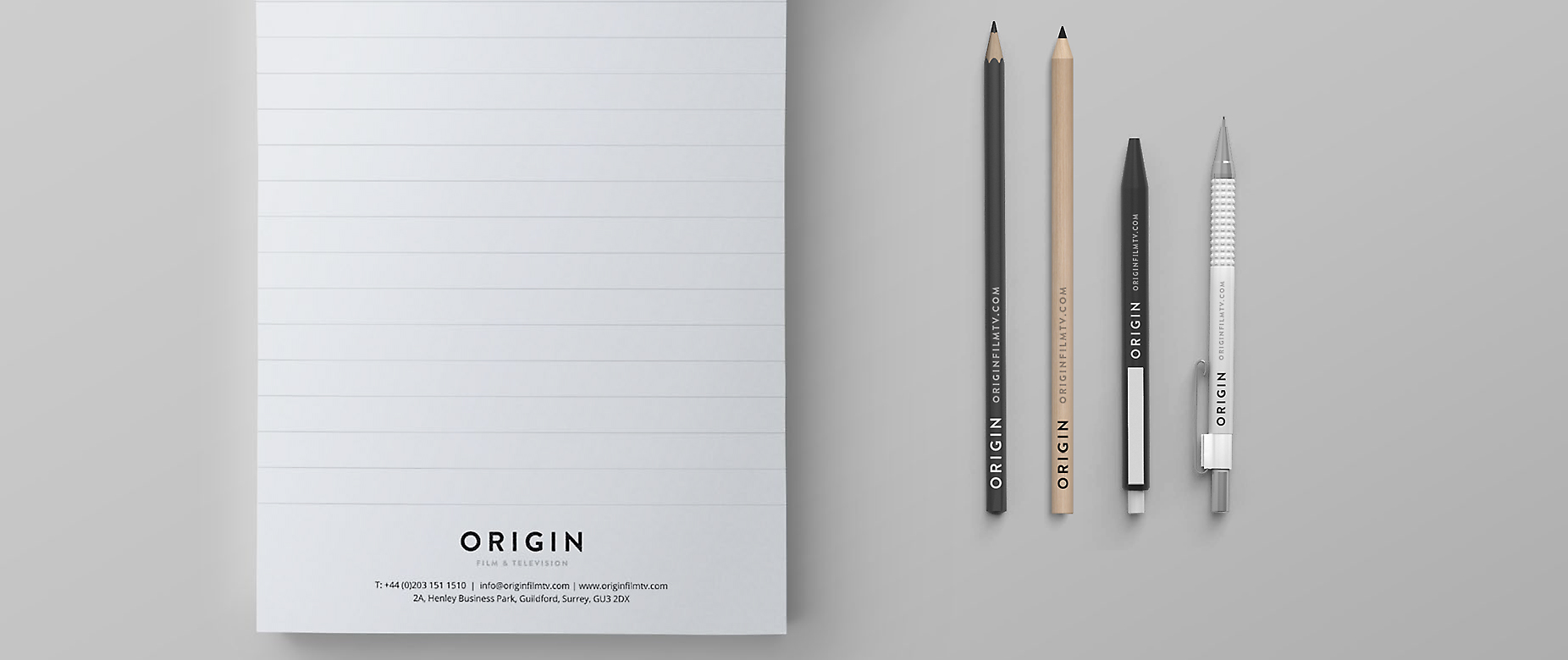
One of the first items on the agenda at Origin was the new venture’s branding. As a new business, identity and how the company is perceived is crucial and we wanted to ensure it was just right.
The company name Origin was carefully chosen – and the design needed to be equally as fitting. While Origin’s core values are rooted in relationships, rising to a challenge and pushing the boundaries of technology – the branding also needed to ensure it stood out from the crowd.
Our aim was to find a design that was clean and refined and could be seamlessly transitioned across the different areas of the industry we work within. With limited design skills in house, we have been working with some great people to make this happen.
After a lot of work, we think we have come up with a great end result. We’ve spoken to many of you and had some great feedback and made some tweaks along the way.
Clean and simple, our new logo and accompanying artworks have been designed in a simple black and white, however we’re not afraid of a bit of colour!
The final result looks good. It’s simple, clean and refined and we can’t wait to see it in action. Keep an eye out for the Origin branding – it’s all set to become a familiar brand and a force to be reckon with in the future.
We’re already prepping designs for our new vans, pads, pens, pencils, trucks and more and we can’t wait to show you everything as it arrives. In the meantime we thought we would give you a little glimpse.
We hope you like it and welcome your feedback…
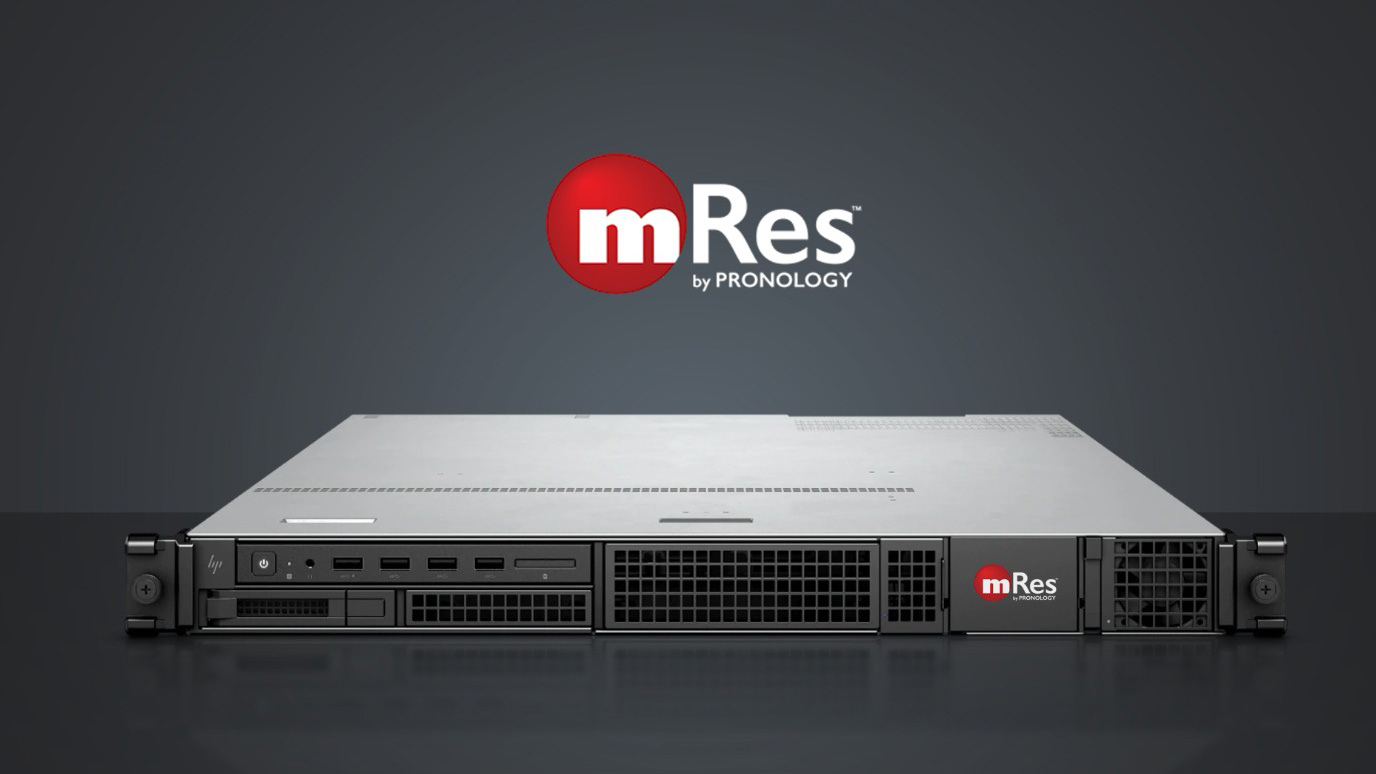
Multi-channel, multi-codec, real-time live recording with frames rates of 23.98 – 60fps up to 4K. 100% resilient and fully compatible with Avid / Adobe, we’ve had them for a while and have been putting them through their paces. Rackable, stacka...
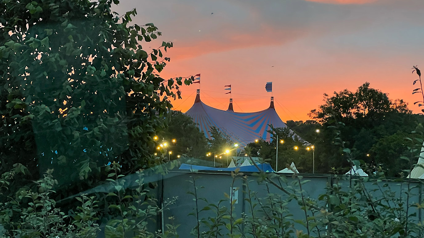
Vans loaded to the brim, engineers packed and ready, and Origin is off to Glastonbury 2022!
With our Senior Solutions Architect James Fishwick returning for his 4th year and one of our newest, but experienced engineers Chris Frankland jo...
2A, Henley Business Park,
Normandy,
Guildford,
Surrey
GU3 2DX
Workshop 5,
The Bottle Yard Studios,
Whitchurch Lane,
Bristol,
BS14 0BH